
Are you someone that understands and is more motivated by the numbers? Well then, this first point is sure to convince you to introduce some design into your business, because in short, design is fiscally beneficial.
In 2005, a group called The Design Council studied 63 portfolios of companies that traded on the FTSE (Financial Times Stock Exchange) over the course of a decade.
hat they discovered was that the companies that put an emphasis on design did way better than the ones that didnt they outperformed the FTSE 100 index by 200% in fact. Check out the graph below that shows just how much better the companies that put an emphasis on design (red line) do when up against the top 100 businesses on the FTSE (green line)!

Graph courtesy of Eglinski. Check out the performance of design-alert businesses (red) against businesses that arent design-conscious (yellow) and the FTSE 100 (green).
A more layman-friendly figure that this study by The Design Council also determined was that every £100 a design alert business spends on design increases turnover by £225. So, investing in design is a bit like investing in future profits, it may cost a bit now, but a little down the track, these studies suggest that youll likely be glad you did so.
Were in a world now where just about every business is online in some form, in fact encountering a business website is often some peoples first encounter with a business at all. This, ontop of the fact that a lot of businesses now are 100% online means that the impression your website leaves is more important than ever. And how do we leave a good impression? Good design.
A study has determined that badly designed websites are often not read, trusted or visited for any length of time. Poor interface design was particularly associated with rapid rejection and mistrust of a website, the study states, In cases where the participants did not like some aspect of the design the site was often not explored further than the homepage and was not considered suitable for revisiting at a later date
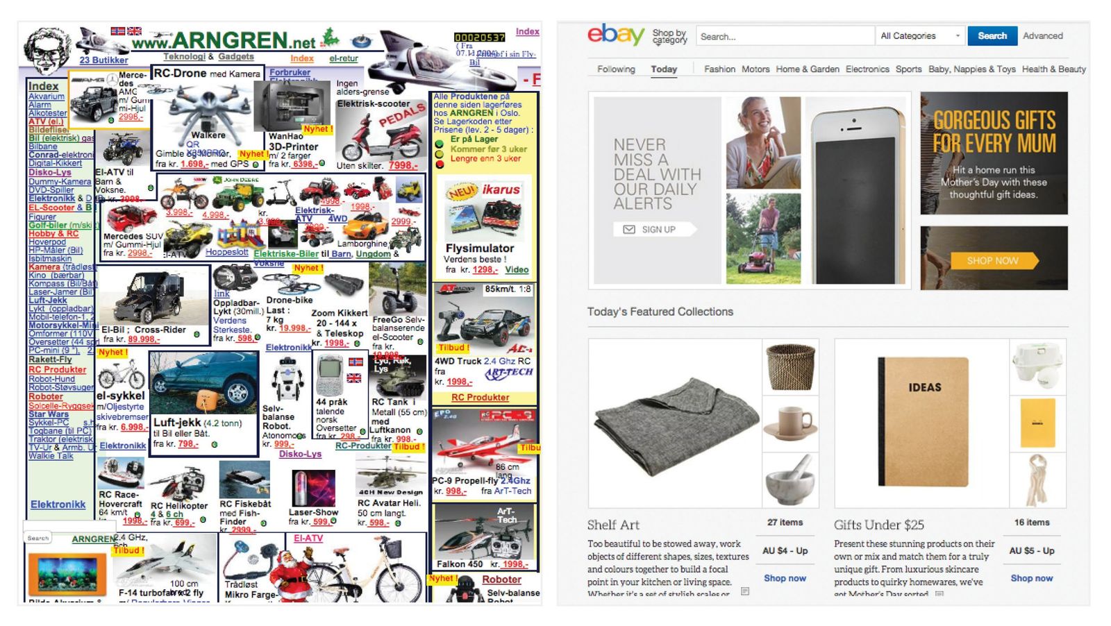
A comparison of two online retail sites, one that has little attention to design, and the other has less content, but a more digestible and user-friendly design.
And dont try to justify a poor website design by saying at least my content is great, because 94% of the reason the participants rejected a site was for design related issues, while only 6% was for content-related issues. So, your content could be stellar and as top-notch as ever, but a poor website design can bring it all to a crashing halt.
So, what things should you look out for when designing your website? These are the things that participants of this study noted were deal breakers: Busy layouts, lack of navigation aids, boring web design, pop up advertisements, slow introductions to a site (splash pages, slow-loading flash introductions, etc), small print, too much text etc.
Keep an eye out for sites you find successful, and try to pinpoint why they are successful and introduce this into your own online endeavours.
Have you ever watched a cooking show and noticed how much effort the chefs put into presentation? They labour over it and get grilled (pardon the pun) for any errors. Why is this? Sure, a lot of it is a part of the art of cooking, but the rest of it goes down to the old adage you eat with your eyes.
We generally use all of our senses when consuming food, and sight is a huge part of this. So when marketing food on the shelves of supermarkets, how do we make the product appealing when we cant plate it up? Packaging design.
Now, packaging design is not immune to this eat with your eyes concept, in fact its pretty arguable that it matters even more so for packaged goods than plated ones. In his book Blink, Malcolm Gladwell determined that slight changes, additions and tweaks to the packaging of certain products changed how people reacted and tasted them. Blogger Joseph Putnam summarised some of Gladwells findings as such:
If you add 15 percent more yellow to the green on 7 UP packaging, people report that it has more lime or lemon flavor, even though the drink itself was left untouched.
On a can of Chef Boyardee Ravioli, a picture of a close up of a real human face influences perceived quality more than a full body shot or a cartoon character.
In the Hormel logo, adding a sprig of parsley between the r and m causes customers to perceive the products as being more fresh.
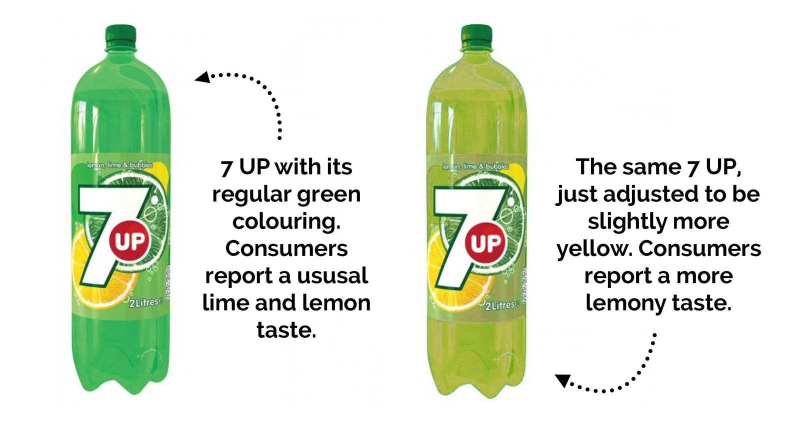
A simple adjustment to the design elements of a product can have a huge effect on how your product is perceived.
These findings by Gladwell not only prove how true the eat with your eyes concept is, but how legitimate design practises are. Even the first 7 UP example alone proves that the concept of colour theory (that people have distinct subconscious reactions and associations to certain hues) has some weight behind it.
So, for product retailers who work within the realm of packaging, making specific and calculated design decisions can make a huge difference with how consumers perceive and consume your product.